
Each client has a different Layout on their tengoPOS till. The function of the buttons can be edited in a simple way to allow you to further tailor the button to your requirements. An Administrator level till login is required to undertake these changes.
PLEASE NOTE: It is not advisable that more than one person in your organisation edits buttons at the same time – you may overwrite each other’s changes. It’s advisable to take a backup before you start in case you make a mistake, using the export button on the button layout as shown below. Changes are implemented instantly across all devices using the same layout code as the one you are editting.
Basics of Editing
The first step is to hold down control on the keyboard, and tap the section of buttons you wish to edit. You can also right-click on the section if you have a mouse or track-pad attached. This opens the Edit panel on the left of the screen, and a larger representation of the group of buttons on the right.
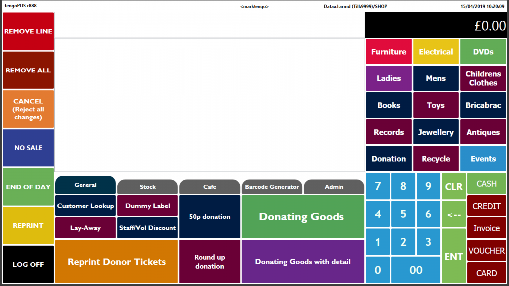
For this purpose the screen is divided into 5 sections or Panes-
- Left hand pane
- Center pane
- Right hand (Product) pane
- Number pane
- Tender pane
Below is a version of the Product pane-
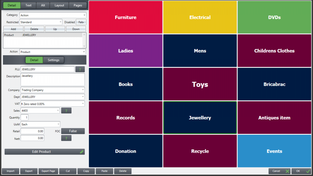
Click once on the relevant button and you will see the Edit panel on the left contains information controlling what happens when you press that button, and its appearance. Here, the button we have chosen is Jewellery. On the right the Jewellery button will be edged in green, to show that is the one you can edit on the left. Clicking / pressing on the buttons to the right changes the panel on the left automatically. Here is a basic guide to the most commonly used functions.
To change/add the product sold:
PLEASE NOTE: If you copy a button selling a product, and paste it in a different location, the below still applies as the copied button will be set to sell the same product as the one you’ve copied it from.
- Detail tab at the top is already open, category should be set to Action
- The current product name sold will be in the dialogue box below. Highlight it and press Delete above – if adding a product for the first time, click ‘add’ and it will default to product
- Press Add above then in the PLU box type all or part of the PLU
- Clicking the ? box will produce a list of all possible matches from which select the product you are looking for. If there’s only one match, this will be auto selected
- The Detail and Settings pages will then pre-populate with existing info about this product. NOTE You can Edit product details from here in the same way as from \\PROD > Edit. To do this, press the Edit Product bar at the bottom of the Edit panel
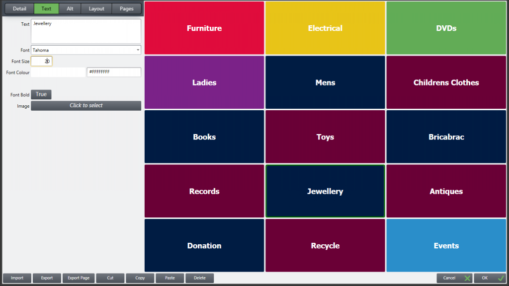
- At the top of the page open the Text tab, where you can replace the existing product description on the button with the new product. Note the existing product description as held by the system will initially appear by default when you remove the old text
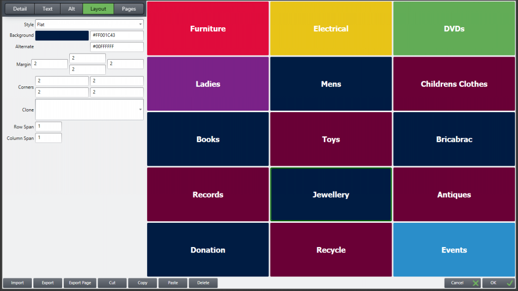
- The Layout tab at the top allows you to set Background colour should you wish to change it, and the Shape, size, margins etc. of your button – for ease of configuration, use ‘clone’ to choose an existing button design from the drop-down menu. You can also make a button span more that one column or row, should you wish to make one bigger than the others, or have more room than you need for buttons 1×1
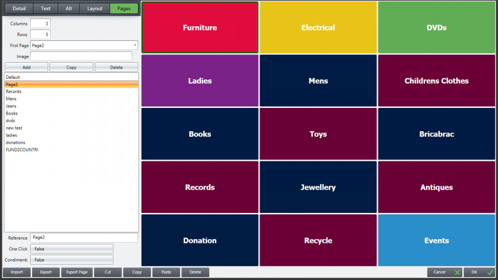
- The Pages tab lists all the pages (also referred to as ‘sections’ or ‘layers’) in this area of the till. Note the front page is typically called “Page 2” by default. The Columns and Rows numbers at the top can be changed, but note they apply to ALL pages. It is not possible for instance to have Page 2 set as 3 x 5 as in this example, and then the Books page 4×5.
- When finished, click ‘OK’ bottom right and your changes will be saved, and the button will sell the new product
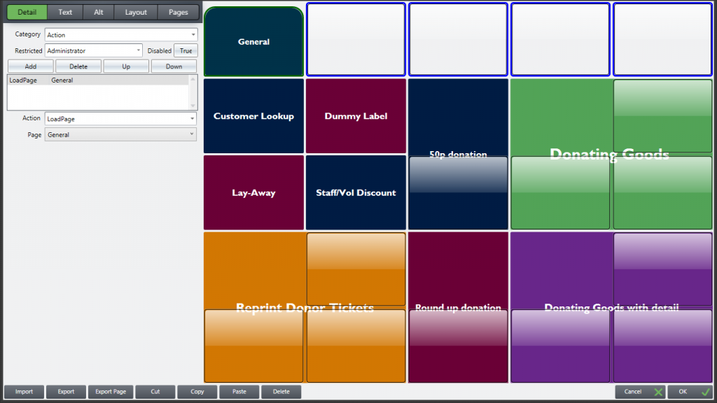
- Note in the Detail panel near the top the word Restricted. Buttons can be restricted so they can only be used by certain levels of user. See the article Adding and Editing Users. Product buttons would be open to all, so set as Standard. Some admin buttons though your organisation may want to restrict to Managers or Administrators. If a Standard user is logged in and presses such a button a message will appear on screen to advise they can not access that function
Load Page function:
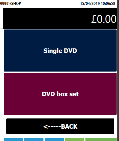
Rather that have a button linked to one product, when pressed the button can reveal another page of options, for instance if you sell DVD’s, pressing the DVD button on the front screen of the till can take you a page including single DVD’s, boxed sets, maybe different price categories.
- The Product section of the till screen is usually the top right part, as per example screenshot here.
- In a simple layout, each of these buttons is linked to a product. Press the button, one of those products is sold
- But there is only space for say 15 products. (n.b. the number of columns / rows can be changed as we will see later, but the standard 3 x 5 layout seen here is a good starting point, as individual buttons get smaller the more you have)
- To give room for more products, we can program a button to load another page rather than sell a product
- In this simple example, pressing DVD’s reveals another page with the choices on, in this case just two, but you can change the number of buttons on the second page to suit your requirements
- There also needs to be a Back button, to get you from the sub menu, back to the main menu
- Planning your layout, thinking about the number of products you want individual buttons for, how many you want on a page etc. is vital. The till needs to be simple to operate and “intuitive” for users
- Further products can be added in the Middle section of the till, which we will look at later
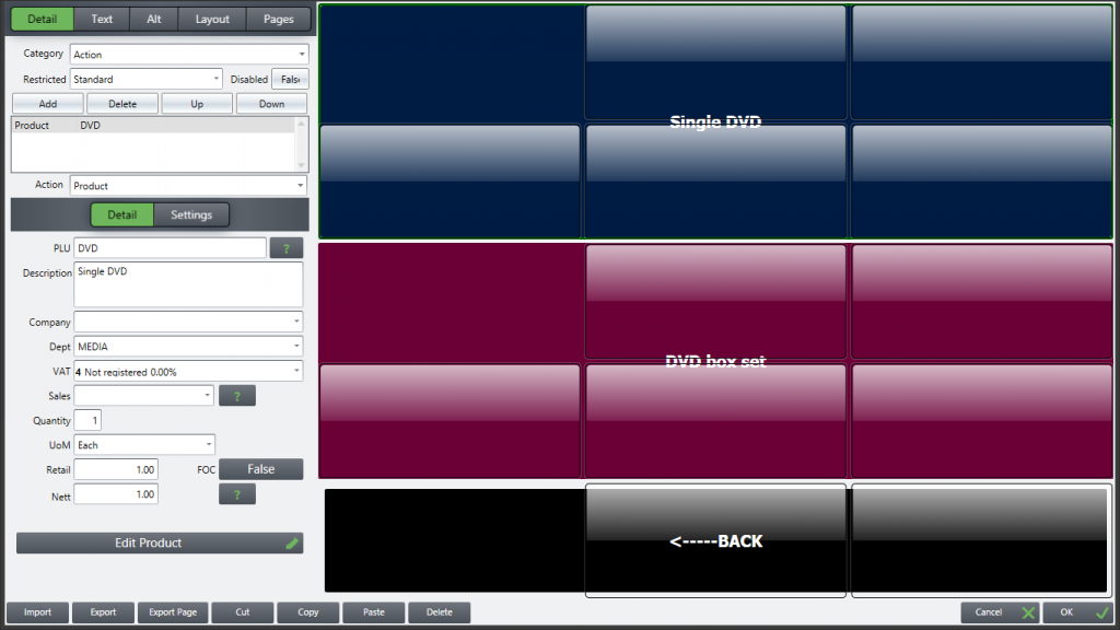
Pressing the green DVD button gives us this “page” in the top right corner of the till, where the choice is between two products we sell, Single DVD’s and Box Sets. In this case (for instance a charity shop) all single DVD’s have a set price as do Box sets, so these buttons as shown will sell one of the items when pressed, at a fixed price.
Bear in mind for some clients, goods are sold by scanning their bar code, the best way if you have 100’s of lines. Trying to create buttons for too many items can be confusing for users.
We now will look at how to create a Page and make it load from the front screen
Planning – Are your products already created? What do you want to call the sub menu page? How many items will be on it? What is the maximum number of buttons you will need on any particular page – remember that has to be set at the beginning as all pages in a section have to have the same number of Columns and Rows, so leave enough buttons for your products without making them too small. Individual buttons can be made to span more than one row or column. Think about the need to add further lines later, if that is a possibility, leave a few blank buttons on the page as these can easily have products attached to them.
- Right Click, or hold Control and tap a button in the top right “Product” section of the till to open the Edit screen for that part
- Press the Pages tab so it goes green as shown, as we have to create the new page first. This tab lists all the currently created pages, yours will look different and may only have Default and Page2, if you have not created any others.

3. The layout you see to the right is an expanded version of the top right part of the till (because this is the area you wanted to work on). Note the first layout you see, as shown, is the front screen and is known as Page2. You will see on the right of this screen whichever page layout you highlight from the list on the left
4. Click / press the Add box at the top of the list of pages, to create a new one. you will see a screen like this
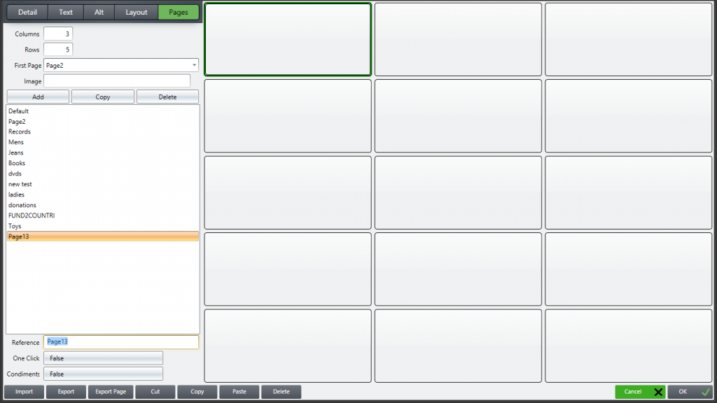
5. Change the name (where it says Page13, by “Reference”) to your chosen one
6. Highlight the Detail tab, top right of screen
7. Highlight one of the blank buttons on the right side, the border goes thicker so you can be sure you are working on that one as shown below
8. Category select Action, click Add and product automatically appears in the box below. The Action defaults to Product as this is the most commonly used, other Actions can be found by clicking the drop-down arrow by the word Action just further down the screen
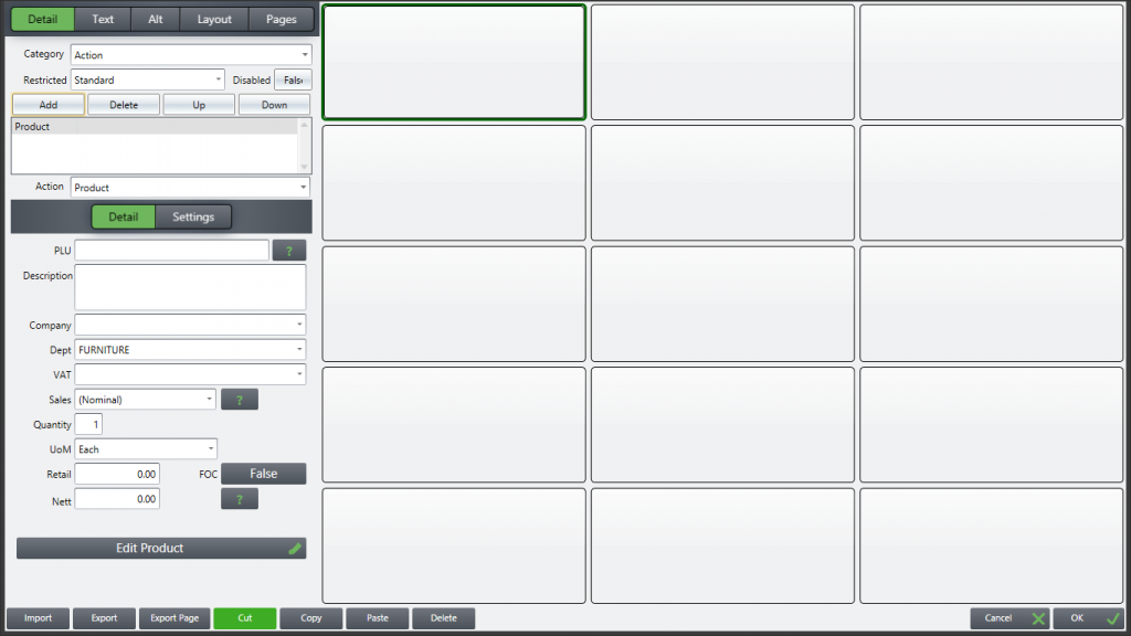
9. You can then select your product (if already created) using the ? search feature. This will populate the fields with all the information already input, follow the process earlier in this article about Adding / Editing products
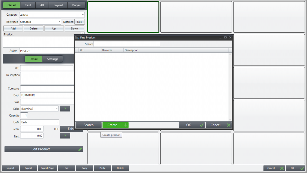
10. You can create a new product from here, by pressing ? without putting in any detail, and then Create+ as shown below, then type in details directly onto the screen – PLU, Description etc. The Find Product screen disappears, so you can input detail on the screen below. Make sure your product details are consistent with the other products you have already created, e.g. PLU, Department, Supplier if required, VAT etc
11. When the product details are in, highlight Text at the top of the screen to type the name of the product as you want it to appear on the button. You can change the font, make bold, re-size from there
12. Then highlight the Layout tab to color and shape the button. This can be complex, so if you have buttons already use the Clone function to copy the formatting, which will include the Text size and font
13. On the Layout tab you can also spread the button over several rows / columns. Below is a screenshot of the DVD page as an example, where each product button starts in the top left, but is then made to span 2 Rows and 3 Columns. This is how the layout shown earlier (DVD page on the till) was created
14. Continue with each Product you need on buttons – But remember to leave at least one button free for “Back” so that when using the till you can quickly return to the previous page
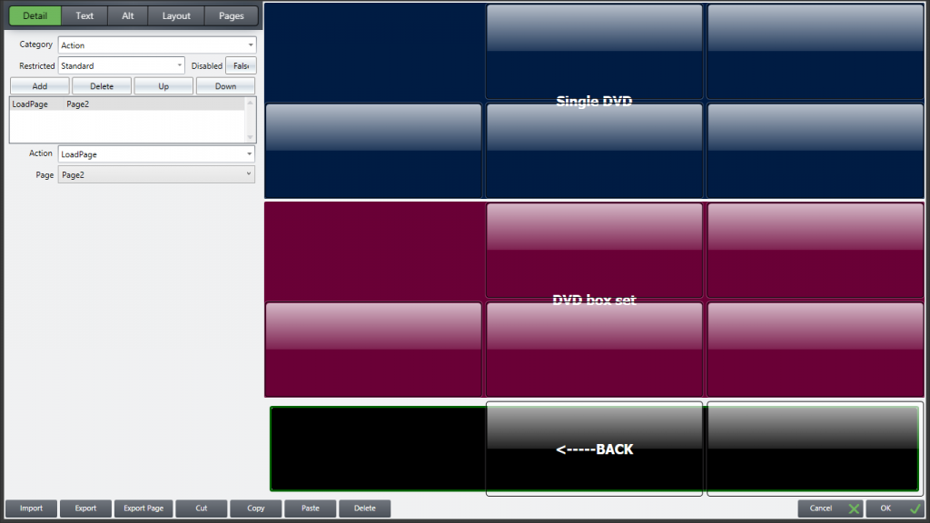
15. Back Button – see below, the Action here is LoadPage, not Product, and you want the button to load Page2, the front page
When you have finished creating your page, press OK to save
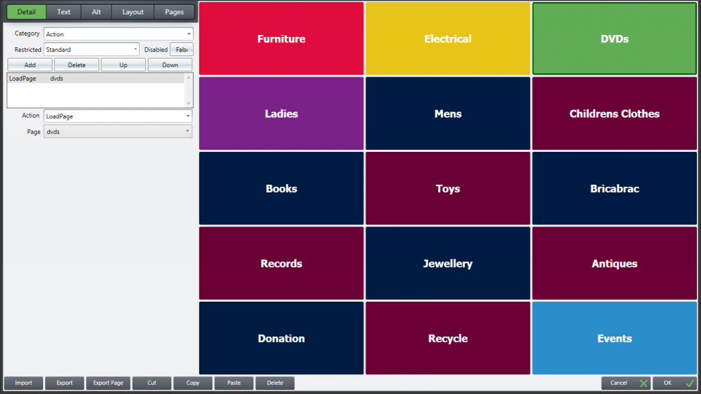
16. You then configure the button on the front screen (the green DVD button in the example) so that it loads our new DVD page or sub menu. Below, the green DVD button is highlighted (darker border) and on the Detail tab, Add the Action LoadPage and select dvd from the drop-down menu, which will list all created pages
17. Finally press OK to save the changes
Remember the order to do things when adding new products and new pages –
- Make sure your departments are created, in particular any new ones your products require
- Although you can create products from the Edit screens as shown above, to ensure consistency some prefer to create all the products first using Add on the product screen (\\PROD, or the product listing button if you have one)
- Create your new page and add all the products, include a back button to Load your front page (may be called Page2)
- Only when you have done this can you create the link from your Front page, to load the new one.
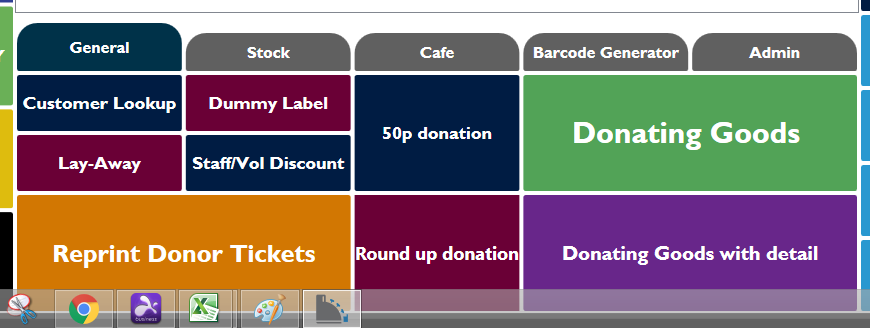
Editing the Middle panel or Centre section
The middle panel is used differently by clients depending on their needs. Below is an example. The top row is often a series of Tabs, pressing the tab brings up a page relevant to that heading. If you have worked through the LoadPage section above, some of the principles will be familiar.
Right lick anywhere in the Centre Section to open the edit panel, click on Pages then highlight Default. You will see a screen as below, which is the key to how this section works.
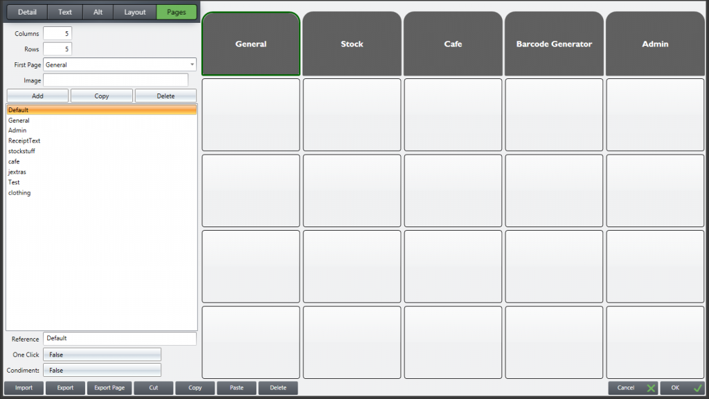
Press the Detail heading, if you have highlighted the General Tab button on the right, you will see its action is set as LoadPage, and the page to load is of course General. The Admin tab would be set to load a page called Admin, etc. The buttons below the top line are left unused, as they will not be visible.
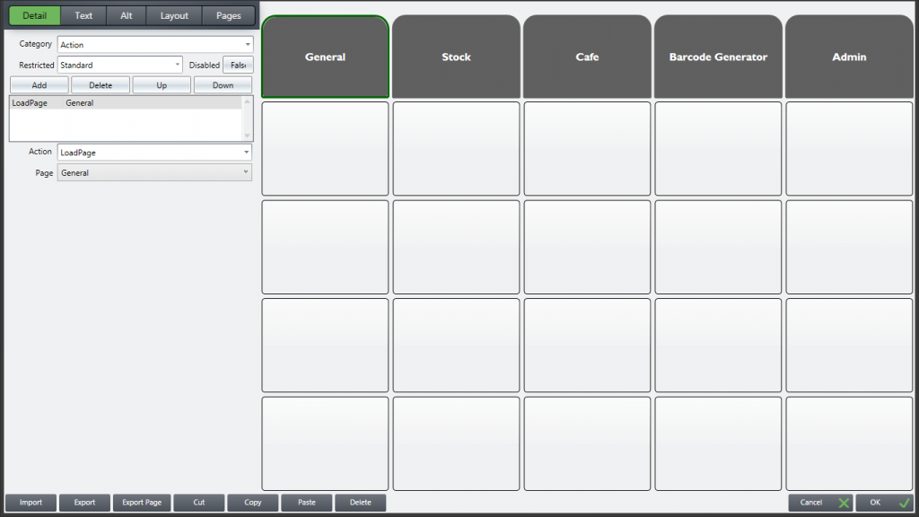
Looking now at the General page, this is created leaving the top row unused, apart from the button matching the General tab on the screenshot above, the Default page.
That tab is made to look similar, slightly larger and a different shade, so that when you press General from the Default screen, the Tab appears to grow a little as though it is highlighted even though a new page has opened. By leaving the other buttons on the top row unused, this allows the remaining Tabs from the Default screen to remain visible.
Some clients use a section or two for extra products, e.g. the Cafe tab in this example.
Once you have set up your Cafe page, you can use the LoadPage feature from there if you wish to give even greater choices. For instance you can create a page of different Teas, one for Coffees, etc, using the Add page feature, as per the DVD example in the previous part of this article. Have a button on the Cafe page that says Teas, its Action is LoadPage, the page loaded is Teas, and on there could be up to 20 different types of tea to sell, using the lower 4 rows (The top row is left Blank apart from the Cafe tab, which would be in the middle in our example) and 5 Columns.
This article covers most client requirements. If you need any help, contact us at www.tengosupport.com