PLEASE NOTE: The below guide is about customising the standard reports. For completely bespoke/custom reports, see ‘Custom Reports‘.
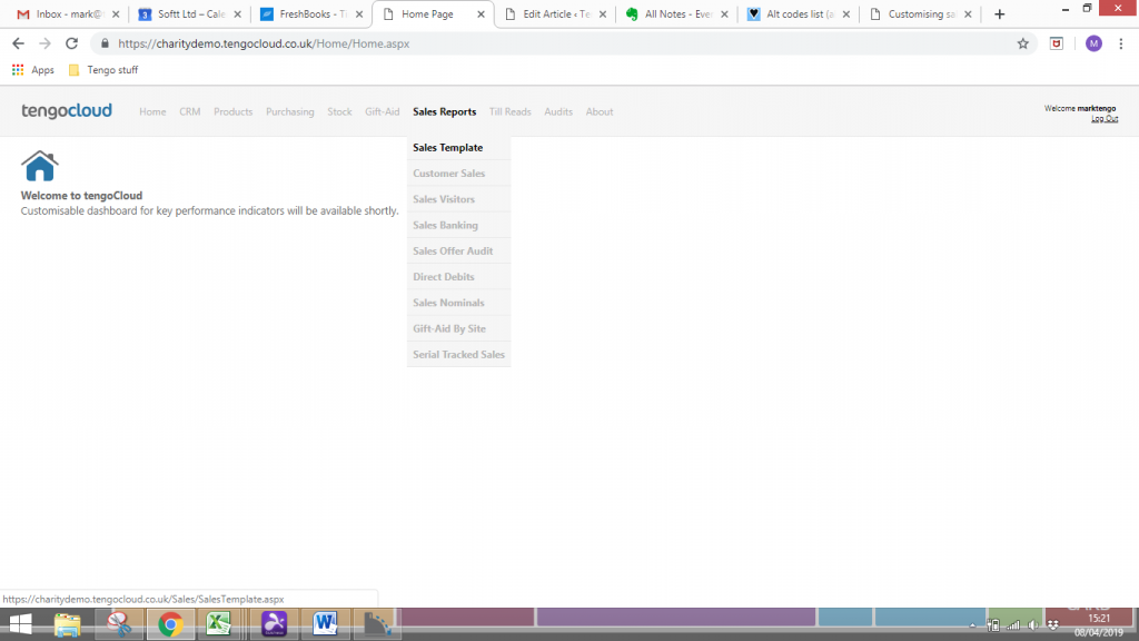
Once logged in, to the right of the word TengoCloud, in light grey starting with Home, then CRM, Products etc are the headings, hovering over these will reveal a sub-menu. We are constantly developing TengoCloud, and some of the headings will not be relevant to your organisation. By far the most often used reports are under the Sales Reports heading, hover over that with the cursor then click on the first on the list, Sales Template.
All of the many reports on tengoCloud can be customised in the same way – the ‘Sales Template’ report on the sales menu is a good place to start – you can filter and group the data to suit your needs, and even export it to Excel or PDF.
Example
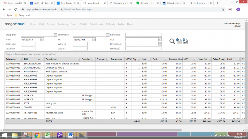
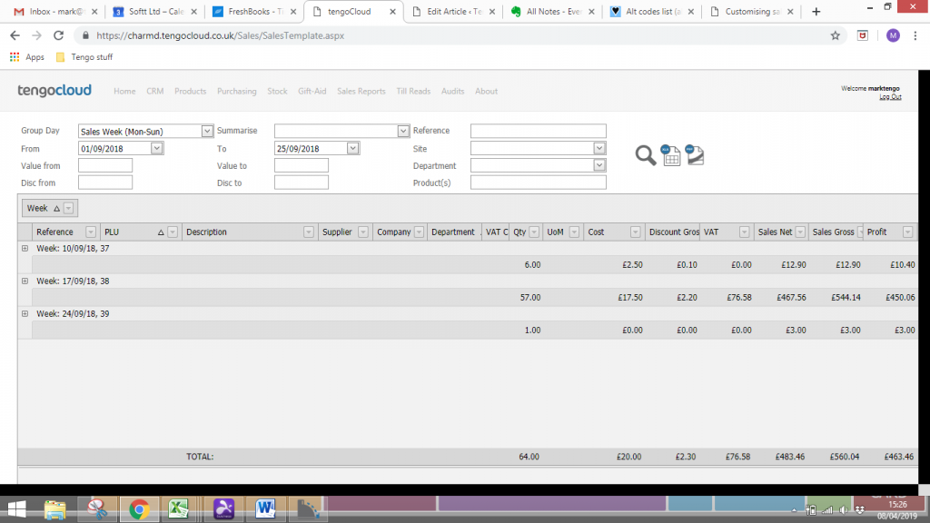
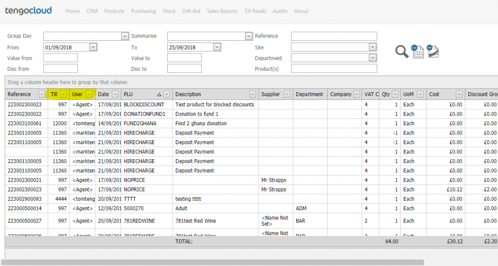
We have opened the sales template report and put in some dates From and To – in this example (screen shot below) we are asking for a list of all sales from 1st to 25th of September 2018, and click on the magnifying glass symbol on the right of the dates. In TengoCloud, this is the Search button. N.B.-
- the screen defaults on opening to the current days date, so then pressing search without changing the dates gives you today’s sales across all your sites
- In our example here (a test database, please ignore the detail) there are not many sales per day – if yours is a large organisation, be aware that searching several weeks across all sites is requesting a lot of information. You will have to wait until it has downloaded. There will be a circle turning in the tab heading at the top of your screen – wait for that to finish. Also you will find the column headings in the body of the report (in darker grey) do not line up perfectly with the information below, until everything you have asked for has downloaded. You will not be able to work on the data until they snap into line. How long this takes also depends on the speed of your internet connection.
- When download has finished, you may notice (depending upon the size of your screen) that not all the information fits from left to right. In the screen shot below you will see the bottom dark grey bar can be dragged further to the right to reveal more columns. You scroll up and down as usual, using the scroll bar on the right edge of the screen
- You can of course change the dates and Seach again, or to start again completely hover back over Sales Reports, then Sales Template, to get a fresh start point
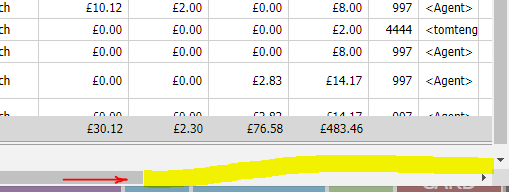
Note you may not be able to see everything on your screen, depending on its size. As you would expect there is a scroll bar near the foot of the page, to you can navigate to the right hand side. Left click on the scroll bar (The grey blue line to the left of the yellow line below) and drag it to the right.
There are various ways of customising the report. We will show some of these below. You can use more than one at the same time as required.
Date grouping (called Summarise Day on the report)
You can add a grouping by individual day, week, or month. For most customers the weekly grouping has replaced the need for any manual weekly reports on performance.
In our example of sales from 1st to 25th September, we will select sales week, Mon-Sun, and press Search. You then get a summary, in this case of the 3 weeks, sales. Each week can be expanded by clicking on the small + sign on the extreme left of the screen, and collapsed down again by pressing the – which then appears. Expanding gives you the individual product sales information, a line for each product sale in the week.
Groupings by field –
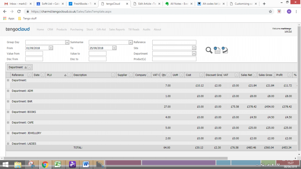
In our example, screen shot below – We started with the full list of sales for the month, then located the column header “Department”, left click on that word and drag and drop it into the bar above the column headings, where it says “Drag a column header here to group by that column”.
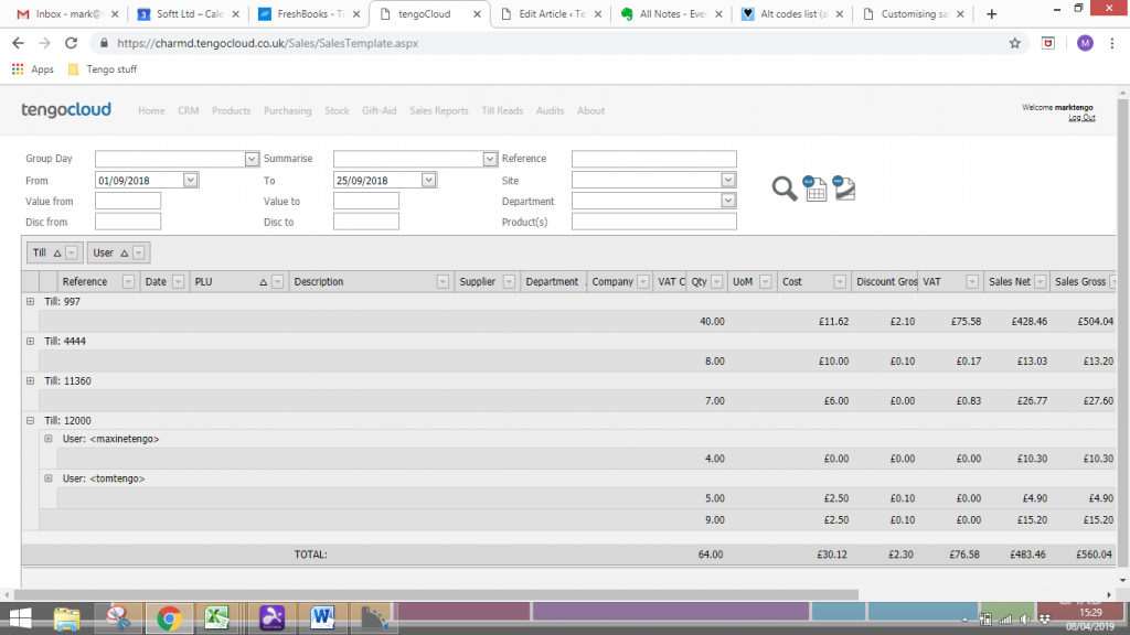
You can add as many groupings as you want, they will be nested with the one furthest left being the top level, and drilling down to the ones on the right. In the example below lets say our organisation has 4 tills. We have firstly put the word Till in the Group By bar, so we have a summary of our sales for the month so far by individual till. If we then put User in as well, we can further break down our analysis so that we can compare sales of individual Users who used til 12000 over the period. Expanding Till 12000 by clicking the + reveals this.
You can return the column headers, in this case Till and User, by dragging and dropping them back into the column header line – anywhere. Here we have put them in position 2 and 3. They will stay there while you work with this data, only going back to their original place when you initiate a new search.
Analysis using column heading filters
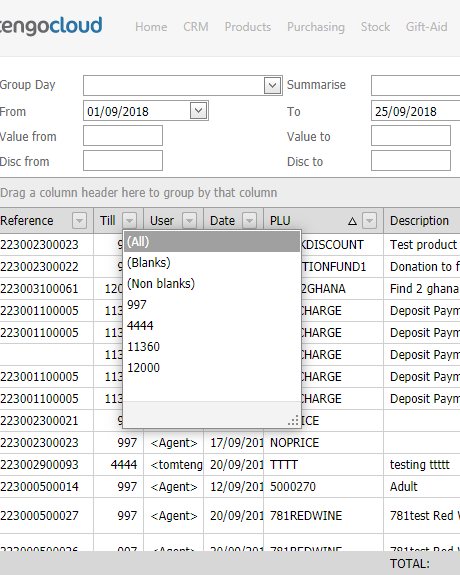
You can filter each column using the down arrow. Below, clicking on the arrow by Till gives all the available till numbers, click on the one you want and the report will just show sales through that till.
Order Ascending / Descending
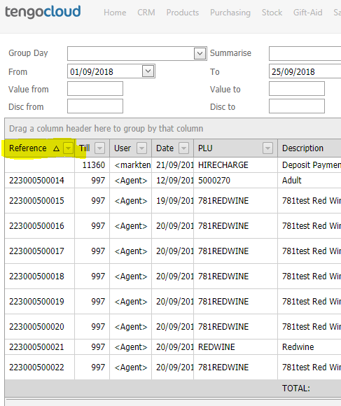
In this example, we want to order the sales by reference number. Click the Reference Column header to the left of the filter arrow. The small black triangle appears, sales now listed in ascending order by sales reference down the page. Click on that again, the order will reverse. Click on another column header to override / cancel the previous one. So we could click on Till to order by till number, losing the reference number order of course.
There are many different options, too many to look at in detail. Please try – you can not break anything, the worst that can happen is that your machine freezes and you have to start again, or you ask for so much information it can not be downloaded. In the latter case, narrow your search criteria. The data on the cloud will remain in tact.
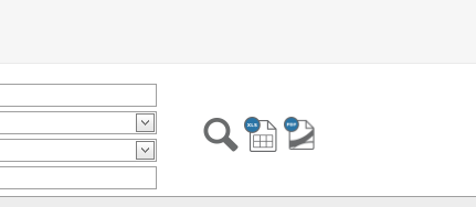
To export your report to Excel or PDF,
Click the icons shown near the top right of the screen, next to the Search symbol. The first is to Excel, the second PDF. You must have this software already installed on your machine.